Friday 21 June 2013

Bibliography

BOOKS:-

Bradley Quinn (2009). Textile Designers. London: Laurence King Publishing. 176-240.

Dawn Devries Sokol (2008). 1000 Artists Journal Pages. 2nd ed. Beverley: Quarry Books. 14-314.

Drusilla Cole (2007). Patterns. London: Laurence King Publishing. 160-250.

Julius Wiedemann (2009). Illustration now! 3. 3rd ed. Germany: Taschen. 196,130,228,316.


WEBSITES

Victoria and Albert Museum. (2013). Fashion. Available: http://www.vam.ac.uk/page/f/fashion/. Last accessed 22/06/13.


Victoria and Albert Museum. (2013). Islamic Middle East. Available: http://www.vam.ac.uk/page/i/islamic-middle-east/. Last accessed 22/06/13.

Victoria and Albert Museum. (2013). Fashion and Textiles. Available: http://www.vam.ac.uk/content/articles/v/the-v-and-a-textiles-and-fashion-collection/. Last accessed 22/06/13.

Wikipedia. (2013). Edwin Hardy Amies. Available: http://en.wikipedia.org/wiki/Edwin_Hardy_Amies. Last accessed 16/04/13.

Wikipedia. (2013). Manish Arora. Available: http://en.wikipedia.org/wiki/Manish_Arora. Last accessed 22/06/13.

Johanna Basford. (2013). Johanna Basford. Available: http://www.johannabasford.com/. Last accessed 22/06/13.

Phillip Black. (2013). We hear it sing. Available: http://urbanfragment.wordpress.com/category/macro/. Last accessed 15/04/13.

Tracey Boyd. (2013). A Boyd Bazaar. Available: http://aboydbazaar.bigcartel.com/. Last accessed 17/04/13.

Sika . (2013). Sika Designs. Available: http://boutique.sikadesigns.co.uk/. Last accessed 22/06/13.

Manchester Art Gallery. (2013). Manchester Art Gallery. Available: http://www.manchestergalleries.org/. Last accessed 22/06/13.

Norman Hartnell. (2013). Norman Hartnell. Available: http://www.normanhartnell.com/. Last accessed 22/06/13.

SAA Illustration. (2013). Julie Ingham. Available: http://www.saahub.com/illustrator/Julie-Ingham/90110. Last accessed 22/06/13.

Karmik. (2013). Designers. Available: http://www.karmik.in/neetalulla.html. Last accessed 22/06/13.

Neeta Lulla. (2013). Neeta Lulla. Available: http://www.neetalulla.com/main.htm. Last accessed 22/06/13.

National Magazine Company. (2013). Manish Malhotra for UK catwalk debut in aid of The Angeli Foundation. Available: http://www.digitalspy.co.uk/bollywood/news/a454539/manish-malhotra-for-uk-catwalk-debut-in-aid-of-the-angeli-foundation.html. Last accessed 16/04/13.

Wikipedia. (2013). Sabyasachee Mukherjee. Available: http://en.wikipedia.org/wiki/Sabyasachi_Mukherjee#cite_note-TOI7-9. Last accessed 15/04/13.

Fashion and Textiles Museum. (2013). The Glamour of Belville Sassoon.Available: http://ftmlondon.org/ftm-exhibitions/bellville-sassoon/. Last accessed 22/06/13.

Outblush. (2013). Outblush. Available: http://www.outblush.com/. Last accessed 22/06/13


Manchester Art Gallery. (2013). Raqib Shaw. Available: http://www.manchestergalleries.org/whats-on/exhibitions/index.php?itemID=95. Last accessed 22/06/13.

Wikipedia. (2013). Mughal Painting. Available: http://en.wikipedia.org/wiki/Mughal_painting. Last accessed 17/04/13.


Atterley Road . (2013). People Tree. Available: http://www.atterleyroad.com/brands/people-tree-clothing.html?mkwid=sUxaSB9Ti&pcrid=23168151978&pkwd=people%20tree&pmt=e&plid=&_$ja=kw:people+tree|cgn:People+Tree+-+%5bExact%5d|cgid:4390224018|tsid:424. Last accessed 22/06/13.


Michelle Reader. (2013). Michelle Reader. Available: http://www.michelle-reader.co.uk/Home.html. Last accessed 21/06/13.


Vogue. (2013). Vogue India. Available: http://www.vogue.in/. Last accessed 22/06/13.

Hannah Werning. (2013). Hannah Werning. Available: http://www.byhanna.com/info.html. Last accessed 22/06/13.

Wikipedia. (2013). History of Sari. Available: http://en.wikipedia.org/wiki/Sari. Last accessed 22/06/13.


Evaluation

Zanab Ramzan
Blackburn College
Person ID – 32905
Learner ID – 43013
Project Title –
Pathway – Textiles and Design

Evaluation
I have created two very over sized scarves made from silk velvet devore, one made from cotton devore which isn't as large, and two fashion installations. To get to this stage was not as easy as I had first anticipated. I had started the project with a very different outcome in mind, but I think this has worked a lot better than that would ever have. When I first made the connection with my heritage, culture and food, I thought about making a garment from a material called hessian which is used in India and Pakistan to transport large quantities of rice and flour. I thought if I could get hold of some of these which would have had prints and text on them of the brand; it would make the connection deeper and make it more personal to me. However, I couldn't get hold of any hessian rice bags at all, so instead reverted to the idea of using a different material, but taking the print from the packaging. I decided to use the brands that I have at home so the connection is as personal as can be. I still wanted this to be about me exploring my culture and heritage, and this happened to be through food. I was starting to learn how important food actually is, especially in India where there is a lot of poverty. This showed me that despite the country being so rich in culture; it was just as poor financially, which made me appreciate the traditions and heritage a lot more.
One major influence that helped me make the link with food, poverty and packaging was Michelle Reader. She creates sculptures from rubbish and packaging in town centres, and I have interpreted her use of the material in my own way which I think has worked well. I haven’t stuck to what I originally chose as the more research and experiments I did, the further I drifted from my original idea, which now that I look back, has not been negative.
When I discovered devore, I knew that I had to use it, and had wanted to colour it as it was white. The process required to do this was screen printing, so I decided to use that all the way through. When I did a dye test on the material, it took away from the print and design, and I wanted the design to be the focal point, so left the devore white. However, I was still keen on pushing some colour in, and thought of doing a digital print, using the rice packaging. The problem with this was that I had to edit the image on Photoshop to make the colours and the whole design sophisticated and elegant. This was hard as I had to keep editing as there seemed to be something constantly missing. Then, when I had thought that I had done everything and I could print, the file was not compatible with the program that was used to print onto fabric.
When that was sorted, I wanted to print onto a fabric called muslin, which is very lightweight and can be manipulated into different ways of draping. The problem with this was as it was printing, the fabric tended to collect together, smudging the ink, and leaving bright red ink blotches which were very visible. I did a few tests of this print and this seemed to happen every time, so I discarded the idea as I didn’t want red ink blotches on my work as most of it was white.
I also tried manu text and screen printing onto a background instead of leaving it plain white, but this reduced the crisp pure effect and the print on its own worked better. Instead, I screen printed onto two lengths of fabric; muslin and cotton with the idea to hang them as individual pieces alongside the devore to have a contrast with the white. I used a random print to create these which is where you screen print without measuring where you are going to print. You print as you go along, which I found to be very difficult as I like to know what I am doing before I do it. This also taught me that I can’t always have control over what is happening, and sometimes have to agree with it without having any input. The random print took a lot of time and thought, but in the end was worth it.
Things turned out to be very different from what I had originally thought, especially when it came to exhibition time and putting my work up. I had planned to hang the cotton and muslin screen prints alongside the devore, but the devore prints being all white worked as a three without these. I still wanted to include them in my exhibition so thought of creating two sari pieces which were just installations as they had been pinned to look like a garment. When these were placed in front of the white hangings, it felt like the brought the whole exhibition together. I felt it was tough for me to make these decisions as I didn’t know if they would work, as I like to know before, but if anything, this has helped me become more open to possibilities of something you didn't anticipate or even consider working.
I also had problems with my exhibition space as I first had a flat wall, which didn't bring out the full potential of my work, so I was then given a corner, which I was then able to display all my work.
As I am always surrounded by colour due to my heritage, I have come to love it and wanted this to come across in my work. Through experimentation, I found that they needed to be toned down, and inspired by the colours on the food packaging, I did just that. I felt it was hard to let go of the brightness as it is a part of who I am, but a part of my original proposal was to consider the traditional, but create something contemporary, and I have achieved just that especially with the fashion installations, as I draped the two pieces as saris; one in the traditional way, and one in a way I thought to be different, unique and most importantly, contemporary. This project is about more than just the sari pieces at the end, and to see the detail and work, a closer look is needed.
If I had more time, I think I would be able to take this project further and develop the designs and prints further, use different materials and fabrics. There is a lot of potential in this project, and as it is personal to me, I feel there is a lot more I could do with it.


Exhibition

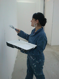
We had to come in during the holidays to start putting the boards up, and cleaning them: filling them in, sanding them down and painting them.


We were then given our exhibition spaces. To start with, I was given a space near a window, that was nearly the whole length of a wall. I tried to make it work with what I was trying to do, but it wasn't. I had to switch places. I was then given a corner/booth which was a lot better, and I knew I would be able to get the most out of my work with it.


I started experimenting with Danielle about how to go about putting my scares up. We got a piece of dowling which is a piece of circular wood, almost like a pole. We put that across the edges where the 2 boards met, and hung the scarves over. One of the problems was that the scarves were 3 meters long and the boards weren't. A lot of the scarf had to be folded over, and I didn't see the point in doing it this way as there was then no point in making them so long. A solution to this problem was to get a longer piece of dowling, and put it across the light fittings, so the fabric was not touching the floor. I thought this was a good idea, but the closest thing we had to dowling in college were these bright red poles that slotted into each other to become longer. 


I then painted all the pieces white after slotting them together and making them as long I wanted them to be. 


As one of the pieces that I used was wood, it had been painted horribly, and there were a lot of staples stuck in it. I didn't want my scarves to get caught on these, so I pulled them out and re painted the piece. 


Also, I didn't want to just throw the scarves over poles, I wanted the whole scarf to be visible, and one solution to this problem was to create a channel for the poles to go through which meant folding over the top piece of the scarves and sewing it, creating a loop, so they could then be threaded through the poles, and wouldn't fall off. 


When I had been playing around with the position of the scarves, I had originally wanted to put the screen printed muslin scarf in the middle. I wanted the scarves to be in a staggered layered composition, so that they would all be visible, but one thing was that I didn't have enough space, and another thing was that next to the devore scarves, the screen printed muslin one felt and looked out of place, almost like it didn't belong there, so I decided to put the thin devore scarf where the screen printed one was supposed to go - at the back and in the middle, and the velvet devore scarves in front on either side.


The missing element was a light, as you couldn't see the design, and once that was installed, it was starting to come together.
I still had the other 2 pieces left to put up - the screen printed muslin one and the backing piece that I had sewn into. One way of putting these up was to pin and drape then on mannequins. That had been what I had wanted to do at the start of the year. I was going to drape one traditionally, and one in a creative new style that I was yet to create, as a part of my proposal and what I wanted to do was explore my culture and heritage, and make it contemporary. This was one way of doing that.


I didn't want to leave the mannequin bare, so cut out a template for a blouse as this is what would have been worn with a sari. I didn't have the time to sew this all together, so decided that it would just be a fashion installation - both of them. I pinned the front and back together, making it appear as the mannequin had been dressed. 
I then had to pin on an underskirt to make it a full length skirt. This needed pleating and pinning, which took time as I had to do that all the way round.


The hardest part of this as I had never done this before was to pin the top scarf correctly. That also needed to to pinned and pleated in certain places, and this sure took a while, but I got there. It needed ironing first. 


It was then onto the next. As I had draped the above in the traditional way, I wanted to drape the second one differently. Instead of having an underskirt, I thought of just pinning fabric that is pleated onto the skirt and wrapping the scarf on top. So, to make it easier to pin the pleats, I ironed the fabric into pleats before pinning it.


I didn't sew any of this either, and this was also an installation piece. I had two pieces of fabric, one for the front and one for the back. 


Again, the hard part was deciding how to drape the scarf without making it look traditional.


I finally decided to make a sort of flower at the shoulder and pin that in place, and as there was a gap between the pinned skirt and the blouse, I decided to pin the scarf in place there as it would cover this up, and it was a new way to wear the sari, making it contemporary by having it wrapped around the waist and then draped over the shoulder.
I wasn't sure where to place the mannequins when I had finished with them, and as I had a floor light that was lighting up my devore scarves, it needed covering and also to bring the whole exhibition together, I placed them in front of the scarves that were hung up. It gave the exhibition a finished appearance.


I feel the mannequins in front of the scarves with the light in the background brings the whole thing together. I feel I have explored what I set out to do, I wanted to explore my culture and heritage, and I feel I have done that by making a connection through food, even though this was not intentional, it shows where research and experimentation can lead you, from what you thought you were originally going to do. I realised that I didn't need the digital print after all the trouble that I went through for it. My exhibition felt complete to me without it, and if I was to still go ahead and print it, I wouldn't know where to put it, and how to present it. 
I also created some tiles and framed some prints to sell in the exhibition shop, which I also think turned out really well. 


These are the tiles that I made. I also framed some of the Photoshop edits that I created. I only did 3 as I didn't know how many and if at all they would sell.