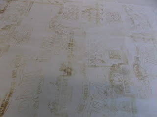
Before I actually printed onto the material, I had to do a test print to see what the print would turn out like. The acid had to be pushed through with a squeegee a few times - it was different for both the devore fabrics as one was a lot thicker than the other.
To make sure I understood what this process actually did, I got some negative photocopies of my design done.
After doing the test print, I realised that I had to make changes to my design. The food packaging that I wanted to use had really thin lines, and it would be a waste to print it how it was onto the devore as it would not show as much, so I had to make the lines thicker and bolder so they would show up more.
Also, I noticed that as I had text in my design, and we were printing on the back of the fabric, when we were to turn the fabric the right way round, the text would be backwards. A good technique to show what this would actually look like was image maker, so I used the packaging design and made a couple of samples. I thought that even being backwards, the design worked, and as the design of the food packaging had not been mine, it changed it a bit, so I decided to stick with it.
The devore fabric was a lot wider than I had thought it to be, it was too wide for the one scarf that I had wanted to make with it, so I decided that I would cut it half length ways and make two scarves out of it. I thought about making them slightly different from one another, so on one half I used the text and packaging that was backwards with the floral motifs and on the other one use the text which was facing the right way, obviously whilst printing this would be the one that would appear backwards, but I had to turn the fabric over as I was printing on the back.
As this was also a random print, so none of it was measured out, I didn't want to make any mistakes, so to think about and help with the composition, I used the acetate photocopies and placed them where I thought I could print onto the devore. This really helped with the process.
After I had printed onto the whole length, it all needed to bake the design. This took over an hour to do as you had to be careful not to iron it too much as that would singe the fabric, burning it and would leave a darker colour on the white fabric, and as I wasn't sure if I was going to leave this white or dye it, I needed this to be done properly.
The above few photos are of the cotton devore, which was the thin piece. I din't want to repeat the same pattern on all of my pieces as it would appear to be the same and there isn't really a point in that so on the thin piece, I decided to print just text, so there isn't any other print on it. The text was backwards and forwards, mixed up. This was also a random print, but as the piece was a lot smaller, it was a lot easier to do.
I wasn't sure whether to leave the devore pieces white or dye them so I did a sample dye and it didn't work, It took away from the design, it almost lost the design, so I decided to leave it white. I also tried painting in the parts the devore had taken away with a small paintbrush, but that didn't work either as it was really time consuming and I had a lot to get through if I was going to paint, and also you had to be careful of not painting the sides which was really tricky to do. Final decision was to leave all 3 piece white as they were.
The edges also needed to be sewn in for the thick devore and the thin one. The thick devore piece had to be cut in half length ways.When I had done that and taken the edges in.
I felt that to make these more scarf like, something was missing. I bought some beaded tassels to put in the 4 corners of the the thick velvet devore scarves. I bought 8, as I thought the thin cotton devore piece didn't need them.


No comments:
Post a Comment