


As well as doing this, I had a look at Manu text. This is a technique which uses a screen and protein dyes. I want to use this to create colourful backgrounds with, but using the dyes, you can write text as well. After applying the protein dyes to the screen, it needs to be dried, and is not visible. Then the Manu text which appears to look like honey, is rolled through the screen using a squeegee, and the colours/pattern become visible again. If I were to use this on a length of fabric, I would need to use a very large screen, and the problem with this technique is that you can only print with the colours that have been put onto the screen 3 times before they start to fade and run out. I would have to keep on creating a pattern on the screen to fill the length of fabric, but depending on how big the screen is, I might not have to as it may be large enough to print the whole piece.


This is the test print I did on the manutext background, but this was done on the lighter side of the manu text. One problem that I had was all my designs/images were on one screen, and it was a very large screen, so if I wanted to use just one image, I had to mask off the rest of the screen, which also made it harder to see where I print the design. I got fed up after a while, as the screen was very heavy as well, and was taking up a lot of time to do just the one print, and I had wanted to get through a lot during the afternoon. The one main thing I need to change about this test is the size of the screen and the layout of my designs on the screen. The floral ones all should be on one screen, and the architectural ones should be on a separate screen so layering the different patterns up is easy.
I did a few prints on some other manu text backgrounds as well. I did try and use more calm colours and think about the combinations, but the problem is you don't know what they'll look like when you print with them, so it's a bit risky to use in my final piece, as I wouldn't want to take the risk of not knowing what it would look like - what if it turned out to look like something that I hadn't had in mind and I didn't like it? I don't want to do it that way. I want to plan it out so I have at least a vague idea as to what and how my final piece will look like.


This is another sample I created. This piece is mainly the architectural design which I am not too keen on. I have drawn on some of the flowers from the floral design to sew/embroider, but as the fabric that I used was muslin, and its quite thin, when I tried to sew into it, it was really hard - I even had the fabric on an embroidery hoop, but it was too thin and kept coming out. For one of my ideas, I wanted to used this material and sew into it, but I don't think I will as it is too hard to sew into. If I do, I won't be able to sew into it. Also, as I used manu text for the background, the colours clash with the design, and attention is diverted from the design which I am trying to make my focus point. I don't think I will be using manu text as a technique to create a background.


This piece is cotton that has been dyed using protein dyes. I am not really fond of this either. I tried to put the two designs together - the floral and architectural, but the screen had started to fall apart, and when I printed one of the flowers, I lifted the screen and there was a big grey smudge. I gave up after this. The screen had to be re done.


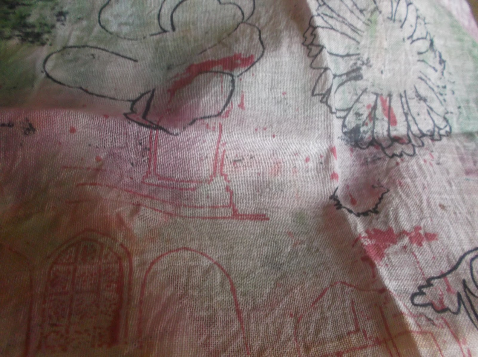


This was the same. The colours of the manu text background are too dominant for the design to come through. Even if they are toned down, I don't think it will work.


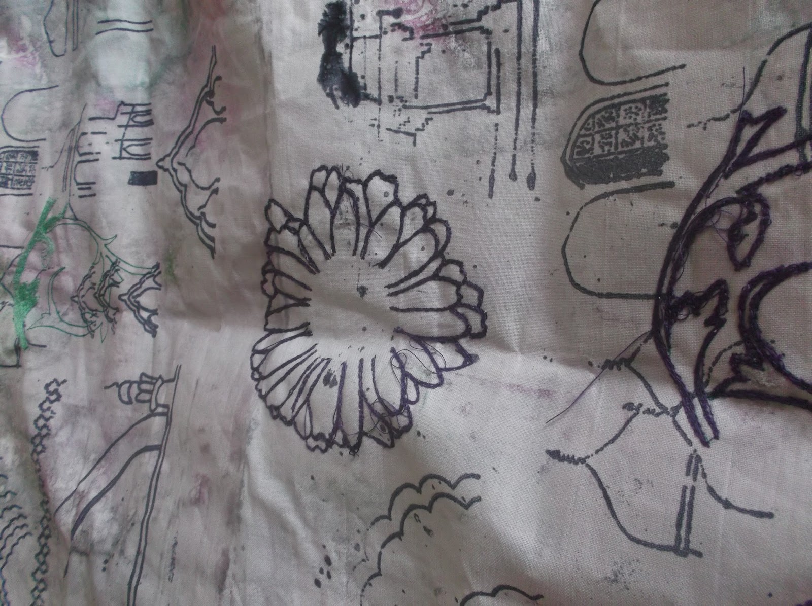
This piece was also on cotton, but the manu text has stiffened the fabric more than I thought it would have. I have also drawn on some floral patterns and outlined them on the sewing machine. I used purple thread, and it hasn't really stood out as much as I thought it would have. However, I do think it adds to the design to have the floral and architectural together.
No comments:
Post a Comment